United States Federal Executive Orders
 |
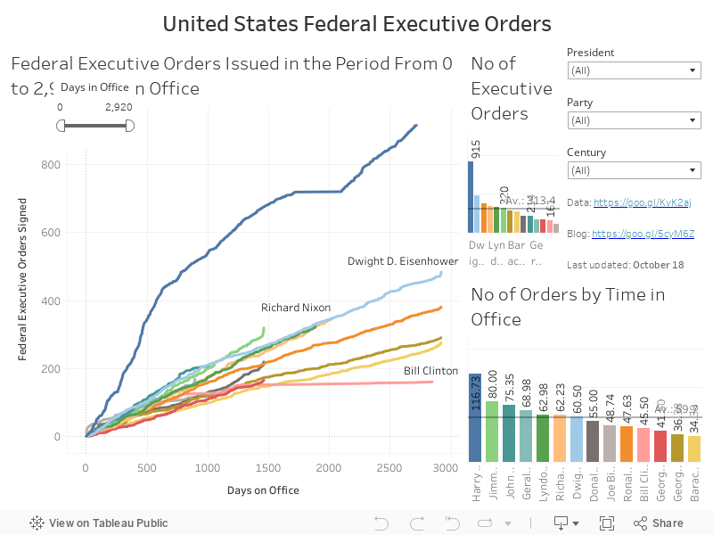
| Screenshot of the Tableau Dashboard. Available [here] and at the end of this post. |
[Note: the dashboard is best viewed in Full Screen (F11) Mode]
Back in early 2016, when Trump was still seen as unelectable, he directed a portion of his Twitter barrage against President Obama on the latter’s use of Federal Executive Orders. I’m not going to pretend that I’m so politically astute that these comments caught my attention at that time. However, when commentators started to contrast Trump’s statements with his actions once in office, I immediately felt that this was a place where a visualisation of the data would be of use and interest. In my defence, I would note that I’m not so naïve that I believe that actual facts and figures hold sway any longer in either US or British politics … we can but try!
The datasource
My initial
experimentations and explorations of this data started with the List
of United States federal executive orders Wiki page. This is quite
high-level data, giving the rolled up figures per US president along with a
handy calculation of their total tenure in office and the overall number of
Orders issued per year. This was fine, so far as it went, but I wanted
something a little deeper. I ended up looking at the supporting Wiki pages
where the numbered Executive Orders are laid out in date order. I eventually
decided to remove the data relating to Franklin D. Roosevelt from the dataset
as it was incomplete (some orders were missing and some orders were undated)
and could potentially add bias to the picture. Thus, the data stretches from
April 1945, when Harry S. Truman took office on the death of Roosevelt, to the
current incumbent. At the time of writing, this comprises 4092 individual
orders across 72 years and 13 presidents. As per my usual working methods, I’ve
directly copied from the Wiki pages and pasted the lot into an Excel document.
The only significant addition was to include a calculation to give the number
of days between a president’s inauguration and the date the order was signed.
The only place where I’ve directly altered the data was for Truman’s order No 9938
(Revoking Executive Order No. 9544 of April 25, 1945, Authorizing the Secretary
of War To Assume Control of a Certain Airport). In the Wiki page the date is
given as March 22 1945, but from the context of the surrounding entries it
appears that the correct year was actually 1948. Not only would it be difficult
for an order in March 1945 to revoke one from a month later, it would have
predated Truman’s presidency by 21 days.
The dashboard
Along the right edge of
the dashboard are a number of filters that allow the user to select which President(s) data to display, their Party affiliation and the Century in which they served. Although Bill
Clinton ended his tenure in the 21st century, the majority of his time was in the
20th. I have chosen not to break up his time across the two centuries, instead
regarding him as a 20th century president. Changes made to any of these apply to all
graphs on the dashboard.
An early version of the
dashboard had each president’s set of executive orders given as a running
total, plotted against the signing date. The result was a series of shaky
lines, standing like isolated stalks of kelp, bowing gently in the tide. It was
neither useful nor aesthetically pleasing. Instead, I have reset all orders to
the cumulative number of days to allow direct comparisons of the numbers and
rates of executive orders between individual presidencies. This graph (Executive Orders Issued) takes up the
entire left side of the dashboard. I have pre-set the filters to remove the
Truman data as he appears to have issued executive orders at a rate
unparalleled by any of his successors. Adding him into the visualisation simply
swamps everyone else. I’ve also pre-set the Days in Office callipers (at the top left of the graph) to show
only the first 200 days of each tenure as it allows clearer comparisons between
Trump and his predecessors. Changes to this filter only affect this one graph.
There are two bar
charts to the right of the main image. The top one calls out the overall No of Executive Orders per president.
The one below recalibrates the data to show a more realistic image of the No of Orders by Time in Office.
Clicking on any of the bars (Ctrl+click for multiples) will refilter the other
graphs to just that selection.
What do we learn?
Just taking the initial
pre-filtered layout of the dashboard (first 200 days and excluding Truman), it is
clear that Trump has outpaced all other presidents in the number of executive
orders signed and the speed of his actions. However, it was not always the
case. Comparing the first c.70 days of their respective presidencies, Obama
outdid every other president (19 Orders), including Trump, but this eased off
considerably after this point. By day 162 of his presidency, Obama had signed
fewer Executive Orders (22 Orders) than all others, with the exception of Bill
Clinton and George H W Bush (21 & 15 Orders, respectively). While much has
been made of Trump’s use of this process, the data clearly shows that by day
200 Trump is easing off. He has (with the exception of Truman) signed more Executive
Orders in a shorter time than any other post-War president, but his figures are
close to those of both Eisenhower and Gerald Ford (both Republicans). By day 200 of their presidencies Ford had
signed 43 Orders (one more than Trump) and Eisenhower had hit 47.
The Bigger Picture
When the Days in Office
callipers is set to the maximum (0-2920) some interesting patterns emerge. Many
presidents show a notable uptick in the numbers of Executive Orders signed in
the waning days of their presidencies. This can be clearly seen with Obama,
George W Bush, LBJ, Eisenhower, George H W Bush, and even Ronald Reagan. It is,
however, particularly pronounced for both Carter and Ford where their ‘trails’
become practically vertical towards the end of their time. For different, if
similarly obvious reasons, neither JFK nor Nixon display this tendency. The
other thing that immediately stands out is Bill Clinton’s use of Executive
Orders. Despite serving two full terms, he has the least number of Orders. The
running total is characterised by an early burst of activity (partly mimicking Reagan’s
progress), but flattening out into two noticeable plateaus. The first lasted
from around day 817 (March 17 1995) to day 1093 (January 18 1996), while the
second one lasted from day 1272 (July 15 1996) to the end of his presidency (day
2847: November 6 2000).
The Truman Show
I don’t know enough
about US presidential history to be able to present an answer to this, so I’ll
ask it as a question: What did Harry S Truman do that he needed so many
Executive orders? From his inauguration in April 1945 to January 1953 he signed
915 Orders, at a rate of just over 116 per year. Even taking into account a complete
hiatus from day 1715 (December 22 1949) to 2092 (January 3 1951), his use of
this instrument was sufficiently prolific as to dwarf all other post-war
presidents.
As always, my final
words to the user are to click on bars, change some filters … get involved in
the data and see what happens … you might be surprised at what you learn!

Comments
Post a Comment