Global Terrorism. A Visual Analysis
 |
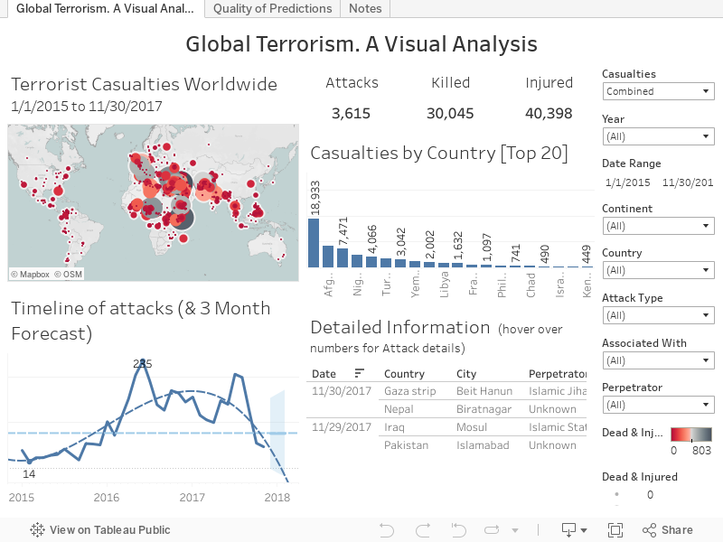
| Screenshot of the Tableau Dashboard. Available [here] and at the end of this post. |
I
recently wrote about my initial experiments in visualising data relating to terrorist attacks. My conclusions were that although the dashboard accurately portrayed
the underlying data, I needed a better datasource to provide more detail and a
broader context. After a bit of digging, I found a series of Wikipedia pages
that attempt to collate all known terrorist attacks across the globe on a month
by month basis. This data runs from the present time back to January 2015 [2015,
2016,
& 2017].
Before this, Wikipedia has data available for the period from 2010-2014
broken into 6-month blocks and data from 1970-2009 is available in whole year pages.
I’ve elected to restrict my choice of data to the period from 2015 onwards for
a number of reasons. A brief perusal of the earlier data confirmed that while
it was richer and more detailed than what I had used previously, it was still not
fully comparable to the data from 2015-17. While I am usually interested
in pushing the data back as far as possible, in this instance I really wanted
to concentrate on the state of the world as it is now.
The datasource
My
process here was to manually take a copy of the Wikipedia table and paste it
into an Excel spreadsheet. As each Wiki page pertains to an individual month and lists attacks by Day, I only had to add Year and Month data manually as I went along. This allowed me to go
with my preferred approach of keeping the date elements separate in the data
source and combining them within Tableau with the MAKEDATE() function. My
reason for this is simple – I was badly burned on an early project where Excel
formatted the complete dates in one manner, but Tableau read them in another.
The result was that I had a Viz
where I claimed that the Battle of Fort Sumter happened on the 4th of December 1861,
rather than on the actual date of April 12th 1861. It’s as true for an
historical dashboard as a business one – if the user can’t trust one element of
what they see, they’re unlikely to trust any of it! In my case, I didn’t notice
until just before I went to promote it … luckily, I spotted it in time and
corrected it, but it meant quite a bit of hasty reworking and being annoyed
with myself. To avoid it, I just take the simple solution and let Tableau
handle it.
The
‘Dead’ and ‘Injured’ columns required a little manual cleaning to remove
non-numeric data. For example, where the terrorists are killed or injured in
their own attacks their numbers are added in brackets after the number of
victims (e.g.: 27 (+2)), these have
been removed. Where figures are given as ‘at least’ or ‘X+’ I’ve gone for the
minimum in all cases. Similarly, where the numbers of causalities are listed as
‘Unknown’, I’ve listed them a 0. The ‘Details’ column has been cleaned of
footnote references as I couldn’t make them work in Tableau, but has otherwise been
left unchanged. Similarly, the columns for ‘Type’, ‘Perpetrator’, and ‘Part of’
have not been modified from the original. Each of these could do with further
work to clean them up as, for example, ‘Type’ (on the dashboard as ‘Attack Type’)
has both Airstrike and Airstrikes along with ‘Assassination’ and ‘Assassinated’
etc. Similarly, the ‘Part of’ column
(on the dashboard as ‘Associated With’) has multiple inconsistencies. For
example, it contains ‘Islamic terrorism in Europe’ as well as ‘Islamic
terrorism in Europe (2014-present)’, an ‘Islamic terrorism in the West’ and a
general ‘Islamic extremism’. Rather than take on the mammoth task of sorting
this out, I’ve left it to the judicious skill of the user to select the correct
data they’re looking for. The ‘Perpetrator’ column has similar inconsistency issues,
but not as frequent. For example, the entries contain both ‘Al-Shabaab’ and ‘Al
Shabaab’. Once again, a bit of judicious data cleaning could be helpful here
and may be something pursue at some date in the future, but for now I’m leaving
this as it is, merely advocating for caution on the part of the user.
These
issues rather pale into insignificance when compared to the issues with the ‘Location’
column! It all looks well and good on the Wiki page … the column shows the
town/city/region and the country, all prefaced by a delightful little flag of
said country as a handy visual reference. Unfortunately, when that data appears
in Excel the flag is translated into the name of the country, giving awkward looking
constructions such as ‘Afghanistan Jalalabad, Afghanistan’ and ‘Iraq Baghdad,
Iraq’. There was no easy way to work with this … at least none that I was
either aware of or technically able to pull off … First off, there’s a
difficulty with inconsistent naming conventions with several names relating to
the same place. In part, this relates to manual data entry by a variety of Wiki
editors. My solution has been very manual and relies on a second Excel sheet
where the ‘Iraq Baghdad, Iraq’ format is preserved as a unique key and a
copy broken out into city and county using the text-to-columns functionality.
This is trimmed, reorganised, and concatenated to a manageable ‘City, Country’ format
(e.g. ‘Baghdad, Iraq’). Any errors
and inconsistencies are then corrected by hand. Once again, I’ve used Chris
Bell’s rather excellent Batch Geocoding service at doogal.co.uk to turn the
‘City, Country’ data in digital Latitude and Longitude. As excellent as it is,
it (and the Google data the service relies on) still has difficulties. In many
cases these are related to locating rather small, obscure places in rural areas
and my solution has been to manually do my best with Wikipedia and (if all else
fails) general locations within the respective countries. The results have been
tested to ensure that the locations at least fall within the borders of the
countries they are associated with. For this reason I would suggest that while
I’ve tried to get the locational data as accurate as possible, it should be
regarded as, at best a guide and in no way definitive.
The
Dashboard
Anyone familiar with my dashboards will find few surprises here. Along the
right-hand edge there’s the familiar list of filters etc. Right on top is a drop-down for Casualties. Here you can
decide how data in the top two graphs (the map and the bar chart) is displayed.
The user can choose to see the data for just those killed or only the injured,
or a combined figure of both. Below this there are two date filters. The first
is a Year dropdown where the user can select entire years. For those wishing
for more granular control, the second Date Range filter is a calipers where periods
down to single days can be selected. Below this there are dropdown filters that
allow the user to select one or more complete Continents or Countries. The
issues associated with the Attack Type, Associated With, and Perpetrator have
already been discussed, and individual dropdown filters are available here with
the appropriate caveats.
Turning
to the dashboard, proper. In the top left corner there’s a map of the world (Terrorist
Casualties Worldwide) with dots for every location, sized and coloured by the
number of casualties (depending on whether the user has selected the Killed,
Injured, or the Combined figure). The keys to the colours and sizes are tucked
away on the right-hand margin, below the filters. The date range in the map title
is dynamic and reflects the date selection choices. I saw this technique for
creating dynamic headers as part of a Tableau training presentation and decided
that it would be interesting and useful to use on one of my work projects, but
I wanted to try it out first and know I could make it work in the way I needed.
It’s a simple trick, but one that’s remarkably effective … and I like it!
Along
the top of the right side are the three headline figures – the cold numbers of
Attacks, Killed, and Injured. My original instinct was to make the figures
large and bold, but I found that my eye was continually drawn to them,
degrading my ability to concentrate on other aspects of the dashboard. Instead,
I have gone with making them slightly larger (but not overwhelming) and giving
them plenty of space to ‘breathe’. For me, they are no longer visually
distracting, but are given sufficient prominence to make their point. In a dashboard
where every pixel of visual real estate has to work for its keep, perhaps the
most extravagant thing you can do is to lavish some white space on your data …
well, that’s my thinking …
Below
this is a bar chart breaking out the Killed/Injured/Combined figures by country.
As a comprehensive list of all countries was too cramped and couldn’t easily be
read, I’ve kept this to just the Top 20. Again, the rank and values are
dependent on the Killed/Injured/Combined Casualties parameter chosen.
In
the bottom left I’ve placed a line chart of all attacks. At the time of writing
(August 2017), the chart shows a low of 14 attacks in February 2015 and a high
in June 2016 with 235 attacks. The important thing about this graph is that I’ve
incorporated an attempt at providing a broad three-month Forecast to the data.
The number of terrorist attacks in any time period is dependent upon myriad
factors that cannot easily be anticipated, much less the exact outcomes in
terms of human lives impacted. For all that, there is something sobering about
being able to read off forecast numbers of dead and wounded that haven’t yet
come to pass. I deal with this aspect in a little more depth, below.
The
final portion of the dashboard, in the bottom right corner, is a text table
laying out all attacks by date. Rather than give the tallies of the dead and
injured as ‘flat’ numbers, I’ve chosen to present them as bars. To save on that
all-important visual real estate, I’ve included the Wikipedia description of
the attack as a hover-over Tooltip.
Predictive
Analytics
Everyone
loves predictive analytics. The thought that you can take the data assets
already in your possession and use them to forecast future states speaks to
something primitive within us, no matter how we’d like to dress it up in sciencey-sounding language. Working with some people in the past, I’ve found that having
some form of predictive capability could be viewed as an end in itself, without
any form of assessment as to either its utility or accuracy. As an initial step
towards my personal understanding of how the Tableau predictive algorithms
work, I wanted to look at the predictions and how they stacked up against the
actual events. To this end, I manually noted down the predicted and actual results.
As stated previously, this type of data is by definition incredibly difficult
to predict. The variety of actors, motivations, opportunities, and skill levels
is impossible to quantify, even leaving aside issues of detection and
pre-attack neutralisation, not to mention recording and reporting biases along with fundamentals as to how terrorist acts are defined in the first instance. It is, in so many ways, a chaotic system. For this
reason it’s not surprising that the Tableau frequently gets it wrong. I’ve
attempted to graph the actual and predicted numbers of Attacks, along with the numbers
of Killed and Injured (bars) against their % difference (lines). It’s still
very much a work in progress and needs further work and thought. However, it’s
clear that that at the time of writing (August 2017) the extremes over and
under estimations can be significant. Looking first at the Attacks, the worst
underestimate, where there were 59 fewer attacks than occurred in reality was
in December 2012 (-57.84% diff) can be balanced against July 2016 when there
were 118 more attacks than forecast (83.45% diff).This is markedly better than
the actual vs predicted numbers for those killed. The greatest overestimate was
in October 2016 when 1020 more people were predicted to die than actually did (-65.57%
diff). The opposite end of the scale was when the forecast fell short and
estimated that 1346 fewer people would die than were killed in January 2017 (159.10%
diff). It is a similar story for the injured. The most significant overestimate
was in March 2016, where 953 fewer people suffered injury than the predictions indicated
(-57.31% diff). Finally, the largest underestimate for injuries came in august
2016, when Tableau predicted 1793 fewer casualties than actually occurred (146.85%
diff).
So there’s your story – big over and under estimates, this type of prediction isn’t to be trusted on this type of data! Except … except … except … that’s not the full story! I’m not quite sure how to go about quantifying it, but it’s clear to me that the forecast algorithm is fine so long as the data is predictable, either rising or falling at a reliable rate (#NoScheisseSherlock). Obviously, sudden changes in the numbers of attacks, deaths, and injuries cannot be accommodated by the forecast. However – and this is the important bit – the model takes this into consideration and adapts accordingly. Sometimes the process takes two months (two iterations) to correct the forecast, but frequently they are back on track by the following month … at least until the next big change. But that’s taking the forecasts on a month-by-month basis. If we look at the averages over this period from January 2015 to July 2017 (27 months) we see that the mean error for deaths is an underestimate of 11.75%, or 0.16 of a person – yep … not even a full person out! The mean difference for the injured is 3.66%, an underestimate equivalent to 25.6 people. In terms of mean percentage difference, the number of attacks is closest to the predicted values, with a value of 0.52% underestimate, or 4.08 attacks.
So there’s your story – big over and under estimates, this type of prediction isn’t to be trusted on this type of data! Except … except … except … that’s not the full story! I’m not quite sure how to go about quantifying it, but it’s clear to me that the forecast algorithm is fine so long as the data is predictable, either rising or falling at a reliable rate (#NoScheisseSherlock). Obviously, sudden changes in the numbers of attacks, deaths, and injuries cannot be accommodated by the forecast. However – and this is the important bit – the model takes this into consideration and adapts accordingly. Sometimes the process takes two months (two iterations) to correct the forecast, but frequently they are back on track by the following month … at least until the next big change. But that’s taking the forecasts on a month-by-month basis. If we look at the averages over this period from January 2015 to July 2017 (27 months) we see that the mean error for deaths is an underestimate of 11.75%, or 0.16 of a person – yep … not even a full person out! The mean difference for the injured is 3.66%, an underestimate equivalent to 25.6 people. In terms of mean percentage difference, the number of attacks is closest to the predicted values, with a value of 0.52% underestimate, or 4.08 attacks.
I
freely admit that this is very much a preliminary examination of the quality of
predictions, using a peculiarly unsuitable dataset. For all that, the results
are interesting and warrant further study.
Notes
Finally,
the Notes tab provides links to the Wikipedia pages where I took my data, along
with an appropriate recognition of Chris Bell’s rather wonderful Doogal geolocations
service.
As
always, my advice to the reader is to use the controls I’ve provided – the filters
and clickable graphs – to explore the data and drill down to find the
information that has most meaning and interest for them.


Comments
Post a Comment