Notifiable Infectious Diseases Reports (NoIDs) Northern Ireland | Trends & Predictions
 |
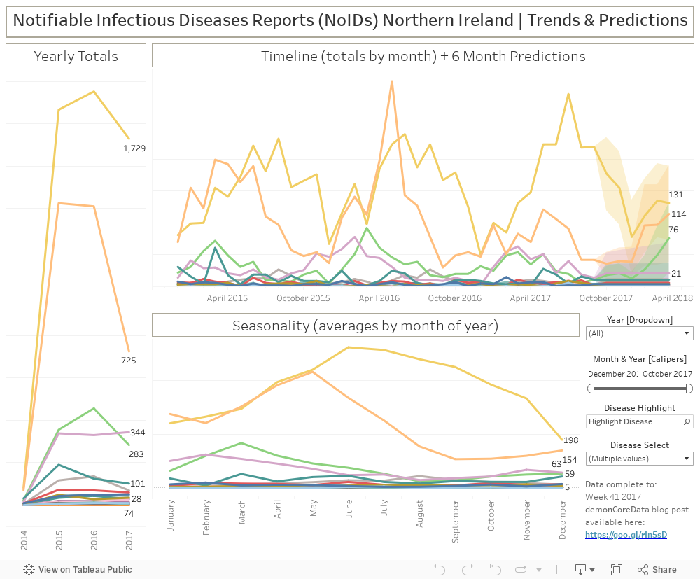
| Screenshot of the Tableau Dashboard. Available [here] and at the end of this post. |
(Updated: see notes at end)
The OpenDataNI website
holds Notifiable
Infectious Diseases Reports, provided by the Public Health Agency. The
available data runs from Week 50 2014 to (at the time of writing) Week 50 2016.
It is a relatively simple dataset, reported weekly, giving the numbers of
occurrences of some 35 Reportable Diseases in Northern Ireland. The individual
reports are based on figures recorded by the Duty Room and Surveillance.
The reports also indicate that: “Food poisoning notifications include those
formally notified by clinicians and reports of Salmonella, Campylobacter,
Cryptosporidium, Giardia, Listeria and E Coli O 157 informally ascertained from
laboratories.”
What I wanted to do
with this dataset was examine a few different ways that the selection of
timescales can result in different understanding of the data and how it can be used to examine trends and predict future states. On the left edge
of the dashboard, I’ve placed the Yearly Totals, broken out by the individual
diseases. While only the line ends have been given totals, hover-over Tooltips
show the name of the Disease, the Year, and the number of Cases. Here we can
see that, by far, the greatest numbers of reported cases are Food Poisoning,
followed by Chickenpox, with smaller numbers of reported cases of Scarlet Fever
and Mumps. We can also clearly see that while Food Poisoning and Scarlet Fever
are on the increase, instances of Chickenpox and Mumps are falling. It is also
clear that the single week of 2014 data plays little part of the overall
picture.
The graph on the bottom
of the dashboard attempts to examine questions of seasonality by averaging the reports per
disease per calendar month. In this way, spikes are evened out across the two
years of available data, and the partial 2014 data does not unduly influence
the result. Here we can see a peak of Chickenpox cases in May, gently falling
away towards September and October, before beginning to rise again at the end
of the annual cycle. By contrast, cases of Food Poisoning show dips in March
and December, but stay consistently strong across the year. Instances of Scarlet Fever peak in March, but appear to fall off significantly on either side of
this, while Mumps are most common in January and December, gently falling
towards August. Again, hover-over Tooltips give additional detail, specifying
the Month, the Disease, and the average value of Cases graphed.
The central focus of
the dashboard is the Timeline graph on the top right, giving the monthly totals
for each Disease. Here again we can see that the reports are dominated by Food
Poisoning and Chickenpox, with smaller occurrences of Scarlet Fever and Mumps. Unlike
the Seasonality chart, the large spike of Chickenpox cases in May 2016 stands out
clearly.
The right-hand portion of the graph leverages Tableau’s native
forecasting functionality in an attempt to predict trends for the coming six
months. The default Forecasting Model used by Tableau (and implemented here) is
an exponential smoothing model that looks for potential seasonal patterns over
a 12 month period. The central line is the predicted future state, while the
lighter colour that surrounds it are the prediction intervals (shown at 95%
confidence). The bigger the field of colour, the larger the possibility for
error. In general terms, the width of this coloured area expands the further
into the future the prediction sits and confidence decreases. To counteract the
effect of incomplete months of data, the model also ignores the most recent
month of data - in this case December 2016. It is clear that this model works well where genuine seasonality
can be observed in a significant body of data. For example, this can be seen to
varying degrees in the data on Chickenpox, Food Poisoning, Measles, Mumps,
Scarlet Fever, and Whooping Cough. However, the model is incapable of dealing
adequately with non-seasonal occurrences of various diseases, such as Tuberculosis
(both Pulmonary and Non Pulmonary), Meningococcal Septicaemia, Hepatitis (both
A and B), and Dysentery. In these cases the prediction is shown as a horizontal
line sitting at the centre of a wide colour band. Within the Tableau application (though not available to the user) is a means of describing the quality of the forecast for each disease. As you can see in the table below, the presence of Seasonality of the data is assessed along with the contribution it makes to the overall trend. Based on this, a broad assessment of the forecast quality is made, ranging from Poor to Good.

Again, hover-over Tooltips
show the name of the Disease, the Month and Year, and the number of Cases.
Based on the available
data, Tableau’s predictive model estimates that Chickenpox cases will increase
over the next six months to 245 cases in May 2017. However, it is clear that
this estimate is heavily influenced by the May 2016 spike and further
examination may be necessary before it is accepted uncritically. Food Poisoning
is also expected to rise to 195 cases by May 2017. Although on a much smaller
scale, cases of Measles may be expected to spike in February 2017 to 4, before
dropping to a single case in the following months. Despite an unparalleled
spike of 78 cases of Mumps in February 2016, the model predicts high peaks of 26
and 27 cases in January and February 2017, falling off to 12 cases by May. From
the available data, it is clear that Scarlet Fever is not only seasonal (spiking
in March every year), but that it is on the increase. There were 72 cases in March
2015, 92 in March 2016, and the model predicts 101 in March 2017. Of course,
the model is limited by having only two complete years of data, but there are
certainly trends here worth exploring and planning for.
The filter controls in
the bottom-right corner allow the user to use a callipers feature to narrow
down the time period by individual months. Below this is a similar filter to
include or exclude complete years. In the future (with more data) it would be possible
to examine non-consecutive years together. Next down is the Disease Highlight
function. This recent addition to Tableau is a quick and easy means of picking
out a single mark within the often-confusing blur of lines on a chart such as
this. You will note that it only highlights a single Disease, foregrounding it
against all the other marks. It does not re-filter or rescale the charts. This
is in contrast to the Disease Select ‘Quick Filter’ dropdown below it that permits
the inclusion and exclusion of entire Disease types to allow the user to
concentrate on those of particular interest to them. While the list of Reportable
Diseases is extensive, there are several that have not been recorded in the
available dataset. For example, in the period under review there are (thankfully)
no cases of Anthrax, Cholera, Diphtheria, or Poliomyelitis (both Acute &
Paralytic). For the purposes of clarity, I have removed the marks for these
Diseases from the graphs, but they can be reinstated by the user, should they
wish.
Going forward, I hope
to keep this resource updated – at least periodically. It is only with a large body
of accurate data that genuine trends can be identified, and preparations made
by both the medical profession and the public at large.
The list of Reportable
Diseases (with links to appropriate Wikipedia pages) are as follows:
Acute Encephalitis/Meningitis Bacterial
Acute
Encephalitis/Meningitis Viral
Gastroenteritis (<
2years)
Poliomyelitis (Acute)
Poliomyelitis
(Paralytic)
Tuberculosis (Non
Pulmonary)
Tuberculosis
(Pulmonary)
Yellow FeverUpdate:
March 28 2017: updated datasource to Week 10 2017
April 30 2017: updated datasource to Week 14 2017
May 20 2017: updated datasource to Week 18 2017
If there are issues with this embedded version, try the dashboard on my Tableau Public page [here]

Comments
Post a Comment